|
For this portion of the logo design process, I was asked to choose 3 of my favorite designs from my sketch. Then, I had to vectorize them. Lastly, I was asked to create 3 variations of those 3 vectorized designs. For me, the most challenging part about the process was figuring out what the variations would look like. It was hard to choose things like color, where I would put it, and more. My favorite part about this process was the end, when I got to view all 9 designs. This was because when I first created my 3 designs, I was sure that that was the perfect color combination and etc. However, after looking at the 9 designs, I realized that I actually liked some of the new logos better. So, this assignment helped me to learn that a switch of color can change a design it dramatically. 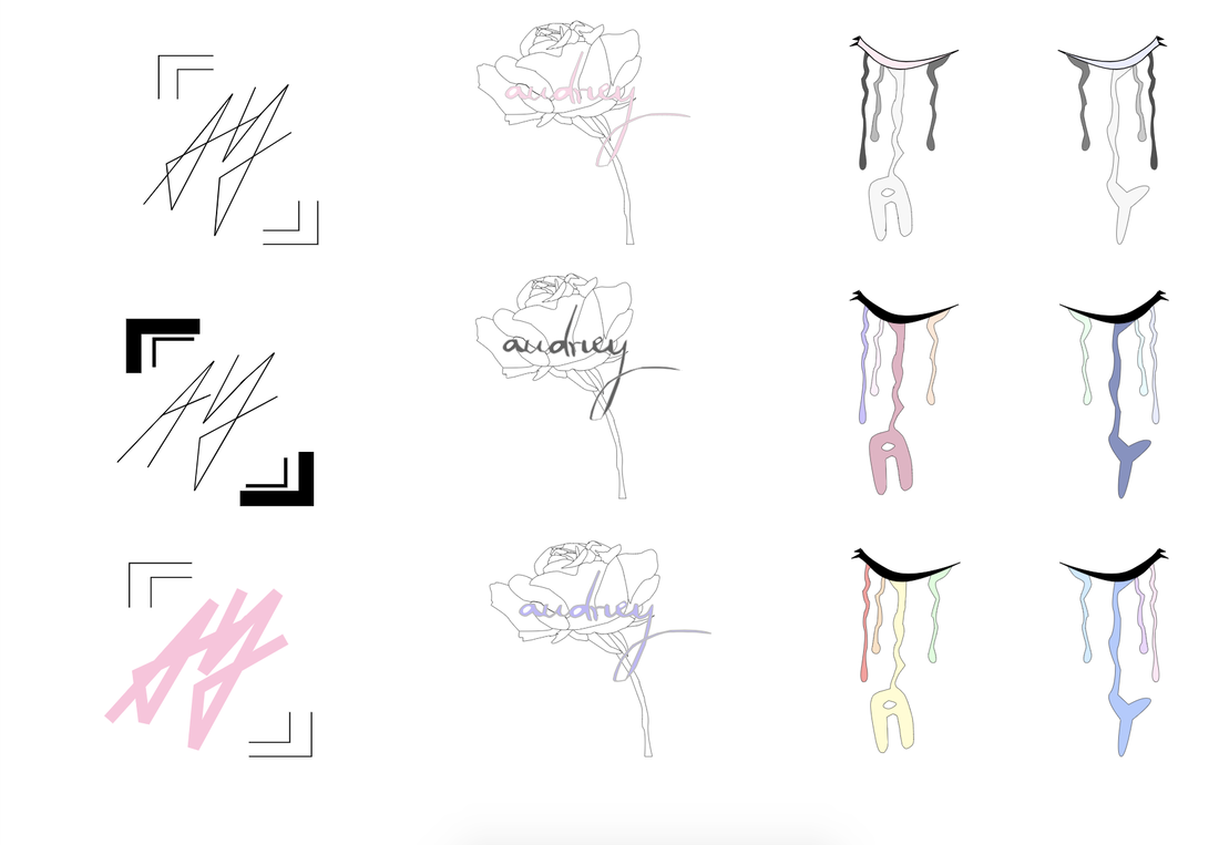 The name of my brand is "Audrey". I created this logo by combining the things that I liked (calligraphy and roses) into one design. The purpose of my brand is to sell flowers - basically a flower shop. It doesn't just sell random flowers, it only sells the ones that I personally favor. This logo represents the brand because it has a rose on it, and that helps people infer what my shop sells. I chose this logo because for me, it's the most visually appealing out of the rest. It looks so elegant and represents my brand very well. I also loved the color combination of lilac purple and grey. In the process of making logos, I think it is very important to make sketches of logos that look totally different. When I did this, I found that my favorite logos were the ones that were totally different from my first sketch. 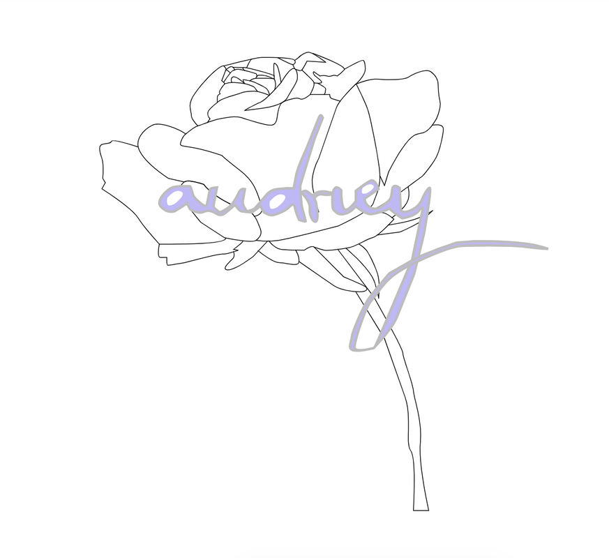
0 Comments
With all of these ideas for my logo, I decided to choose three of my favorites: the one with the rose, the one with the eyes, and lastly, my initials in cursive (on top of the hand). The rose on the first logo represents by love for roses/plants. They're placed around my room and I just love how something simple such as a rose can bring an elegant vibe. For the second logo, it looks like tears are coming out of eyes. However, it's actually paint. Since I consider myself very artistic and creative, I thought it would be a fun idea to incorporate that into one of my logos. For the third logo, since the last two were pretty complex, I decided to go simple. It's basically by initials in cursive. I love the logos that are complex (like the rose and eyes) because I feel like it's very unique and represents me. The logo that I dislike the most is the the one with my initials because it's not original at all and there is no meaning behind it except for it being my initials, of course. This might've been too much of a simple design. I enjoyed this process because I love drawing and I haven't done it in a while. For me, the most difficult part about these sketches was coming up with the ideas for the logos. This is because since the logo should represent myself, I really wanted to make sure that it did so, but in a more creative manner. Overall, I think this project may be my favorite that I've done so far! 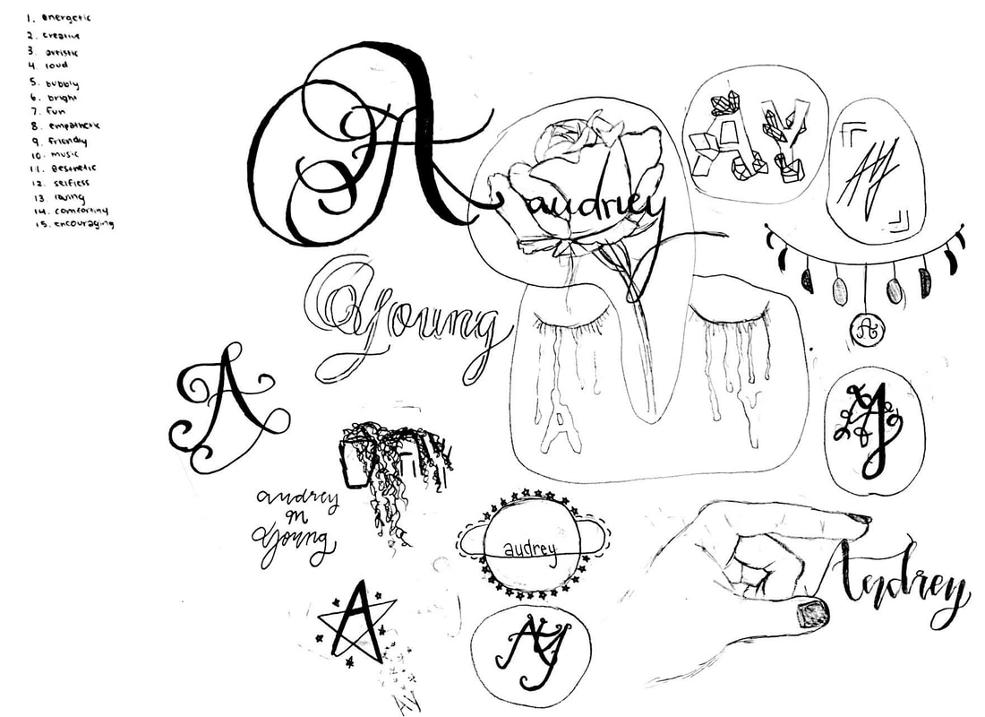 In this assignment, I was asked to work with the Adobe Color website. In this website, I made four different color palettes; monochromatic, analogous, complementary, and triadic. Next, I created a shape with a pen tool using Gravit, while coloring it with the colors from the palettes that I had just created. Lastly, I labeled the colors with their HEX Codes and the name of the color palettes. As I mentioned, I used the Adobe Color website to create the different color palettes. The first, monochromatic, is a color palette that uses the same hue with various saturation and brightness levels. The second, analogous, is made up of hues that are next to each other on the color wheel. The third, complementary, combines hues from opposite sides of the color wheel. And lastly, the triadic color palette is made up of 3 hues that are evenly spaced around the color wheel. For me, my triad color scheme was my favorite out of the four because it included many different hues, while somehow looking good next to each other. Overall, this assignment was one of my favorites because I was able to play around with a new website that was different to any other websites that I had used. 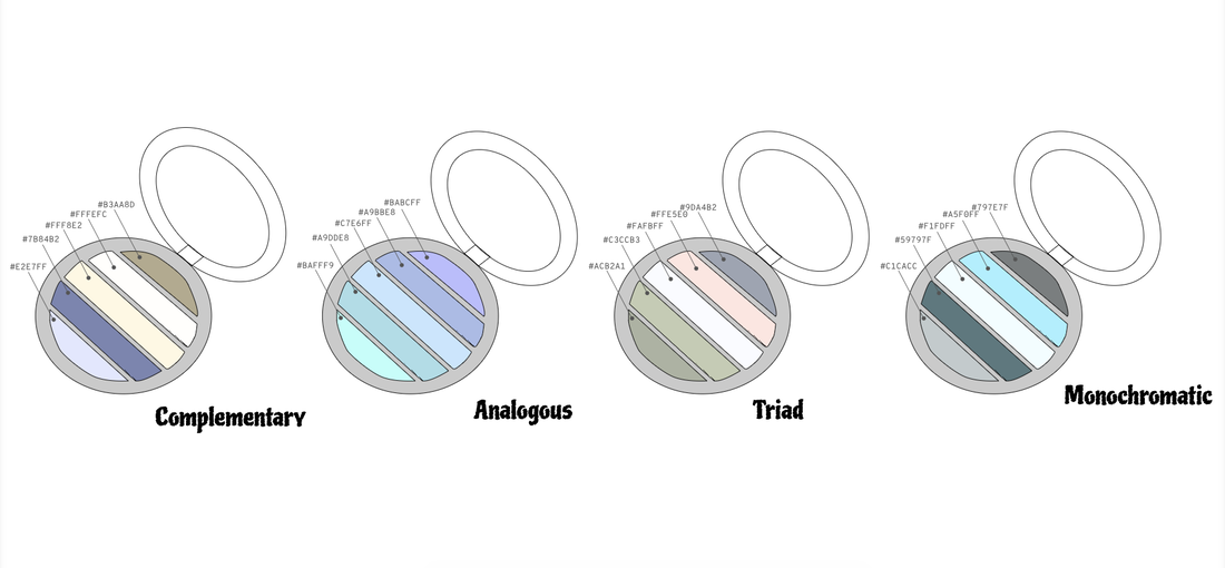 The inspiration to this design:)
|
Archives
April 2019
Categories
All
 This work is licensed under a Creative Commons Attribution-NonCommercial-NoDerivatives 4.0 International License. |
