|
For this portion of the logo design process, I was asked to choose 3 of my favorite designs from my sketch. Then, I had to vectorize them. Lastly, I was asked to create 3 variations of those 3 vectorized designs. For me, the most challenging part about the process was figuring out what the variations would look like. It was hard to choose things like color, where I would put it, and more. My favorite part about this process was the end, when I got to view all 9 designs. This was because when I first created my 3 designs, I was sure that that was the perfect color combination and etc. However, after looking at the 9 designs, I realized that I actually liked some of the new logos better. So, this assignment helped me to learn that a switch of color can change a design it dramatically. 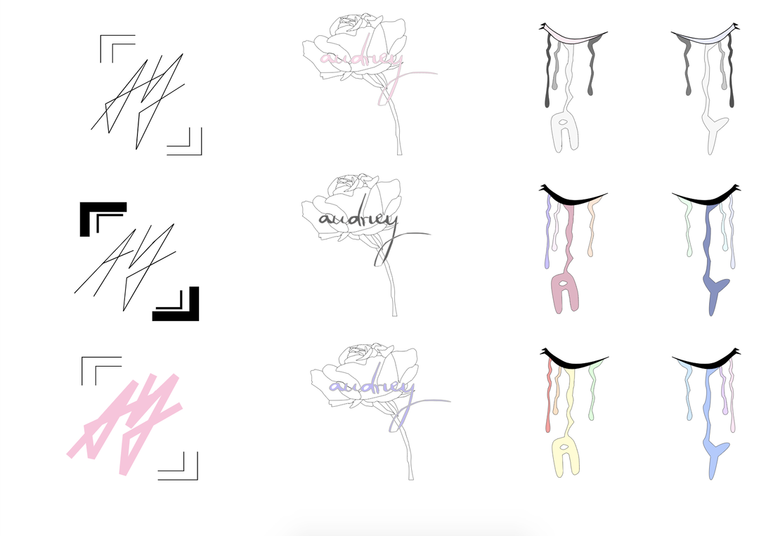 The name of my brand is "Audrey". I created this logo by combining the things that I liked (calligraphy and roses) into one design. The purpose of my brand is to sell flowers - basically a flower shop. It doesn't just sell random flowers, it only sells the ones that I personally favor. This logo represents the brand because it has a rose on it, and that helps people infer what my shop sells. I chose this logo because for me, it's the most visually appealing out of the rest. It looks so elegant and represents my brand very well. I also loved the color combination of lilac purple and grey. In the process of making logos, I think it is very important to make sketches of logos that look totally different. When I did this, I found that my favorite logos were the ones that were totally different from my first sketch. 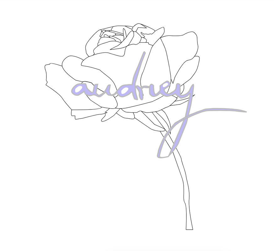
0 Comments
Leave a Reply. |
Archives
April 2019
Categories
All
 This work is licensed under a Creative Commons Attribution-NonCommercial-NoDerivatives 4.0 International License. |
